Icon Modules
- David Schmidt
Table of Contents
Icon Modules
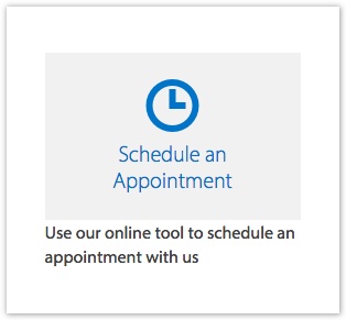
An icon module can be used to create a colorful button. They can be in a two, three, or four-column layout.
Click here to view an example of several icon modules.
An icon module has the following fields:
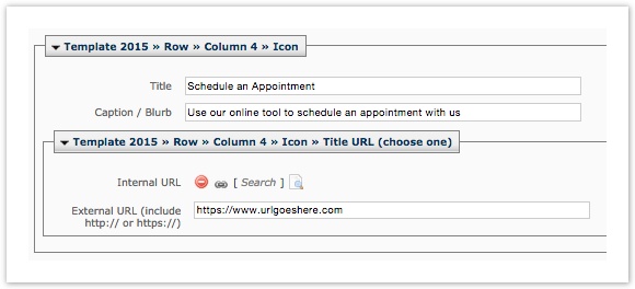
Title Field
This is the title of an individual icon button, usually 4 words or less. In the example screenshot, the Title is "Schedule an Appointment."
Caption/Blurb Field
This field can be used to provide more information to your user about what the button will take you to. In this example, the caption is "Use our online tool to schedule an appointment with us."
Internal URL
Browse to a page internal in Cascade if you want your icon button to link out to a web page. If you use this field, do not use External URL.
External URL
Use this field when you want your icon to link to either a page external to Cascade or to a video. Be sure to use the full URL. If you use this field, do not use Internal URL.
Hidden Fields
Icon Field
Web Services will choose an icon for you that is appropriate to the content of your icon module. There are literally hundreds to choose from. If you want, they can leave it blank so your module is text only. If you want icons in your icon modules, email web@sandiego.edu to discuss options with them.
Color Fields
Web Services has set default colors for the icon module, the background being a very light gray and the icon and text being a bright blue (our "immaculata" blue).