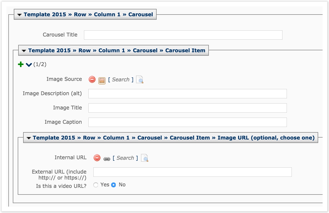
Carousel Modules
- David Schmidt
Analytics
Table of Contents
Carousel Modules
Carousel modules must have at least two items, but there is no max limit to the number of items that can be added.
Use the green plus sign to add additional carousel items. Use the blue up and down arrows to reorder items. Use the red minus sign to remove a carousel item.
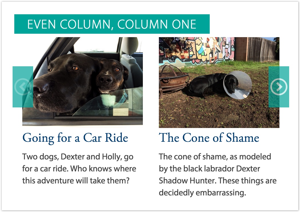
Click here to view an example of a carousel.
A carousel module has the following fields:
Carousel Title
This is the title of the carousel, usually 4 words or less. In the example screenshot, the Carousel Title is "Even Column, Column One"
Image Source
Make sure to upload your image before creating your carousel items (LINK). Add Dimensions
Image Description (alt)
This describes the subject matter of your image. It is the image alt (alternate) text for accessibility.
Image Title
This is the title of an individual carousel item, usually 6 words or less. In the example screenshot, the Image Title is "Going for a Car Ride" and "The Cone of Shame"
Image Caption
A sentence that displays under the image. It can describe the subject matter of the image or provide context about the particular carousel item.
Internal URL
Browse to a page internal in Cascade if you want your carousel item to link out to a web page. If you use this field, do not use External URL.
External URL
Use this field when you want your carousel to link to either a page external to Cascade or to a video. Be sure to use the full URL. If you use this field, do not use Internal URL.
Is this a video URL?
Make sure to toggle this to Yes if your external URL is to a video. This will tell the browser to add a play button on top of your image, as well as open your video in a light window when clicked. This should only be used when including an External URL.