Site Navigation Overview
Table of Contents
Site Navigation Overview
All navigation elements are managed from within Cascade Server. Any navigation updates require the entire site to be published. A daily publish runs at midnight for all USD websites.
Two Navigation Bars
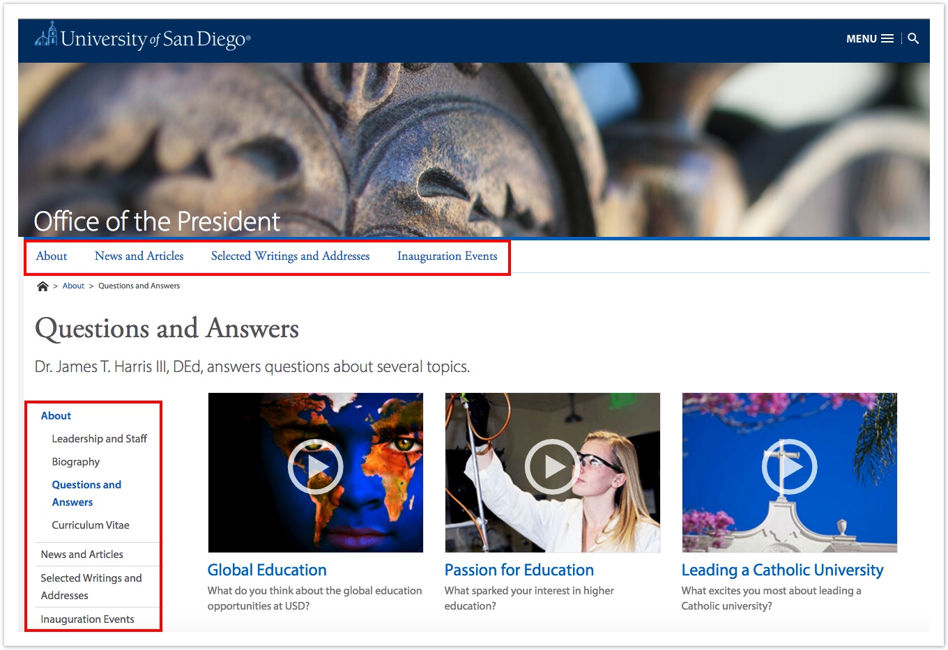
There are two types of navigation bars on USD's live sites. One is the Top Navigation (Top Nav), and the other is the Side Navigation (Side Nav). In the image to the right, the Top Nav is outlined on top, and the Side Nav is outlined on the left.
Top Navigation
The Top Navigation is controlled by the Display in Navigation option under the Edit Tab for a page. The Top Nav appears just above the page's breadcrumbs. Top Navigation does not have rollover events (rollover events are when sub-menus expand from the navigation when a user mouses over it).
Side Navigation
Secondary Navigation appears on the left side of a page. If the selected page has dependent pages, the Side Navigation will expand and display child pages.
In mobile view, the Side Nav expands only after the Triple Dot Icon is pressed.
Collapsed Mobile Side Nav
The red arrow is pointing to the Triple Dot Icon. Clicking this will expand the hidden Side Nav.
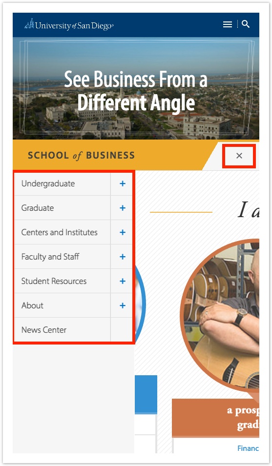
Expanded Mobile Side Nav
The small red box outlines the Closing X Icon. Clicking this will collapse the revealed Side Nav which is outlined with the large red box.


